Project Reference: Temporary Customer Website with Minimal Infrastructure and Maximum Efficiency
As software developers, our goal is to create customized and cost-effective solutions that meet our clients’ needs. In this blog post, we’d like to showcase a project that embodies just that – a temporary, simply structured website designed as a customer touchpoint.
Project Goal: A Temporary Website as a Customer Hub
Our client needed a temporary website to serve as a communication platform for their customers. The main purpose of this site was to provide a central point of contact for customers without requiring complex infrastructure or features. The goal was to make the site efficient and cost-effective, ensuring it was quickly operational and fully functional across all devices.
Technical Implementation: Built Using Standard Web Technologies
The website was entirely developed using standard web technologies – HTML, CSS, and JavaScript. We deliberately chose these technologies for their simplicity and flexibility, allowing us to meet the client’s requirements swiftly and efficiently. By avoiding overly complex frameworks or technologies, we minimized unnecessary complications while maintaining a high level of performance.
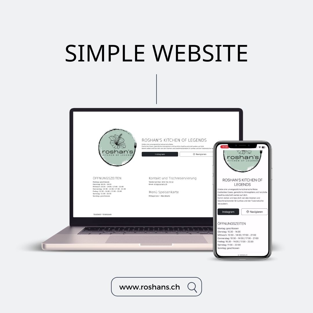
Design and Functionality: Simple Structure for Maximum Usability
The website’s layout was kept intentionally simple to focus on essential content. Its elements were organized in a clean and intuitive way, making it easy for visitors to navigate. Despite its simplicity, we ensured that the website looked modern and professional, helping to build trust with users.
Adaptations on Request: Flexible Support
One of the key requirements was the ability to make changes to the website at any time. During the site’s operation, the client contacted us for updates, whether it was text changes, image updates, or link adjustments. Thanks to the website’s straightforward structure, we were able to make these changes quickly and efficiently, providing flexibility for both the client and our team.
Optimized for All Devices: Responsive Design and Fast Load Times
A major feature of this website is its compatibility with all screen sizes. Whether accessed on a desktop, tablet, or smartphone, the site displays perfectly on all devices. This responsive design ensures that customers can easily access the website anytime, anywhere.
Additionally, the website’s load times are incredibly fast, which is another benefit of its minimalist design and efficient use of resources. Fast load times not only enhance the user experience but also contribute to better search engine rankings on platforms like Google.
Low Development Effort – and Low Costs
A significant advantage of this project was the minimal development effort required. By utilizing proven, standard technologies and keeping the website’s structure simple, we were able to keep both the development time and costs low. The website was delivered quickly, yet it meets all of the client’s needs while offering excellent value.
Conclusion: Simple, Efficient, and Customer-Focused
This project demonstrates that complex, elaborate solutions aren’t always necessary to meet a client’s needs. With careful planning, the right choice of technology, and a customer-focused approach, we were able to create a website that delivers in terms of usability, cost, and performance.
If you have a similar requirement or are looking for a customized solution for your next project, don’t hesitate to get in touch. We look forward to bringing your ideas to life and supporting you with our expertise.
Contact us today for a free consultation!
-
Date
11.12.2023
-
Client Name
Roshans - Kitchen of Legends